
Collective: Why less design is best design: an important reminder when developing marketing collateral.
Poor design forces our brains to try to make sense of what it is seeing, rather than seeking truth.
Smart design is the opposite; it aids our visual system in processing information with clarity.
Here are 4 top design principles to consider when designing your next marketing piece:
1. Order and simplify your message.
Communication hierarchy is key. Define the purpose (key value you bring),
benefits (how your product or service directly improves the life of your customer) and the desired action
(what do you want them to do – Register Now, Donate, Visit nearest store). Anything else is just noise.
2. Create a visual strategy first.
Just as copy must be ‘to the point’ so must design. Before you start designing, define your Visual Strategy.
This can be as simple as a mood board with appropriate imagery, colour pallet and graphics.
3. Use branding.
Don’t forget your collateral needs to fit inside your brand. That doesn’t mean every piece needs to look identical.
On the contrary, brochures and websites should look and function slightly different,
as they are communicating distinctive products and may be targeted at varied audiences.
One solution is to create a complimentary colour palette, supported by secondary fonts and images.
This is called a design suite, an approach many brands use.
4. White space.
White Space in design composition is the same as Silence in a musical composition – it provides structure and rest.
Many studies show white space improves content comprehension up to 20%.
Large spaces between layout elements help the mind to prioritise focus areas while establishing a sense of sophistication and luxury.
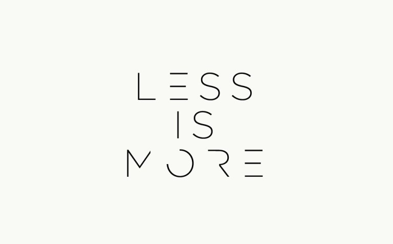
At Sidedoor, we go by the philosophy ‘less design is best design’. We create collateral that increases
comprehension, elevates brand perception and drives action.
For more information on how we can assist you in smart, strategic design, contact our team today.