
Collective: Rethinking rebranding: Why a refresh is often the best option
At some point, organisations realise time has moved on. Growing demand for new products and services, shifts in brand perception, more increasing competition with similar offerings and new opportunities to expand into new markets all factor into the decision to review the brand.
But what happens next? Do you give the brand a fresh lick of paint or a complete renovation?
As we have seen with many big brands, making the wrong choice can have devastating effects so we wanted to dive into the two methods and help marketers better understand the risks, advantages, and challenges with both.
What’s the big difference, anyway?
While the terms ‘rebrand’ and ‘refresh’ are often used interchangeably, they are inherently very different.
In principle, a rebrand is a drastic measure because it’s cosmetic and structural — logo, name, aesthetics, positioning, and narrative. It’s holistic, not just design. Therefore organisations should only go down this road if there is enough proven evidence that the existing identity impairs brand equity growth or blocks the company from achieving its goals (entering into new markets etc).
To that point, if businesses understood the real level of investment required to execute a rebranding strategy correctly, it would most certainly be wiped off the table. For starters, rebranding requires a deep strategic understanding of nuanced market perceptions (extensive market research), ongoing testing and refining of ideas (focus groups), a timely PR launch campaign, and a successful organisational rollout with full acceptance by stakeholders. More importantly, many marketers underestimate the length of time to build positive brand equity from scratch – remember, when a company rebrands, it loses awareness and salience almost immediately.
Looking at it this way, the advantages of rebranding can seem like a fallacy.
On the flip side, a brand refresh is less risky. A cosmetic adaptation of what currently exists, you have a creative license to go as far as you like provided a business’s heritage, history, and values (its essence) remain intact. Strategy is still required, but more so to ensure the new execution is on-par with industry trends, consumer taste and the brand’s core value. Best of all, brand refreshes provide an opportunity to go back to the company’s origin and isolate what made it so special in the first place – the WHY factor.
To be crystal clear about the difference between the two…
The Brand Refresh Strategy
The purpose of a Brand Refresh is to tweak the visual aesthetics and narrative, such as the logo, colour pallet, tagline and imagery, without radically changing the brand’s essence – heritage, position, and proposition. Choose this option when:
- The business has proven positive equity across perception, product quality, and reputation
- The brand’s products and services have evolved but not changed
- You want to expand into new markets with the same product offering
- The communicative and visual execution is no longer on-trend or adequately represents company values
- You want to reach a new demographic who may not consider a brand like yours
- You need to align your brand’s execution with consumer perception OR change consumer perception with a new execution
Key Advantages: Safer option; less intensive process; demonstrates leadership; preserves brand integrity; clarity in purpose and message; heightens marketplace differentiation; promotes opportunity for earned media.
Key Challenges: Inconsistency across the business (if some elements/assets are tweaked but not all), smaller investment can equal marginal changes, creating less impact.
The Rebrand Strategy
The purpose of a Rebrand is to tear down what was previously built and start new. Rebrands significantly alter aesthetics and narratives, with the brand essence, meaning, and proposition changing along with it. Choose this option when:
- There is proven evidence the existing brand has lost value across perception, product quality, and reputation
- The company has changed focus or entered into new markets
- The old identity and purpose are no longer fit for purpose
- Untenable loss of differentiation in the market
- You are legally required
Advantages: Alignment with new corporate focus; reach new markets.
Challenges: High risk and cost to execute properly; loss of brand recognition and salience; alienate existing customers; stakeholder resistance and adoption; overcoming past perceptions; unable to live up to the new standard.
A rebrand / refresh case study: The good, the bad and the ugly
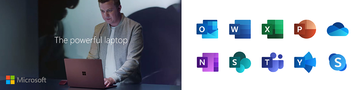
MICROSOFT
Over the years, Microsoft has gone through many logo and visual evolutions to keep pace with companies like Apple and Linux. The black ‘Pac Man’ text logo created in the 1980s represented “movement and speed” and enjoyed a 25 year run. But eventually, time caught up with the brand that had pivoted and expanded its products and services from computer software to entertainment, devices, and gaming. In 2010, “Be what’s next” replaced “Your potential, our passion” as the new tagline, and in August 2012 Microsoft revealed a new bright, colourful and modern logo and emblem, perfectly timed with the release of newer versions of nearly all products. The company said “This wave of new releases is not only a reimagining of our most popular products, but also represents a new era for Microsoft, so our logo should evolve to visually accentuate this new beginning. The Microsoft brand is about much more than logos or product names. We are lucky to play a role in the lives of more than a billion people every day. The ways people experience our products are our most important “brand impressions”. That’s why the new Microsoft logo takes its inspiration from our product design principles while drawing upon the heritage of our brand values, fonts and colours.”
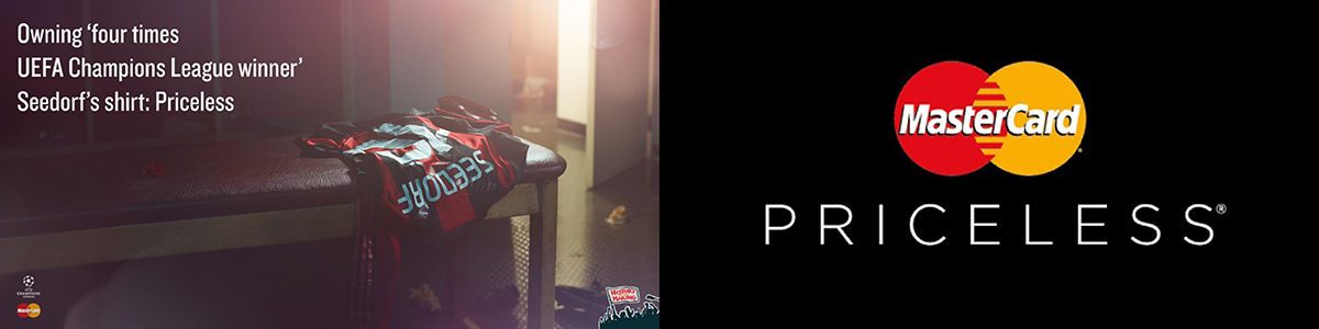
MASTERCARD
Known initially as Interbank from 1966 to 1969 and Master Charge from 1969 to 1979, in 1997 MasterCard was experiencing intense competitive difficulties and lacked consumer relevance thus needed an idea to give the brand a new lease on life. The impending challenge gave birth to the new slogan and campaign concept ‘Priceless’, one of the most awarded taglines and campaigns in advertising history. The impact this move generated was huge – Mastercard were one of the first financial institutions to own a “human, empathetic” positioning by acknowledging there are more important things in life than payments. In 2016, the company releveled its first logo revamp in more than 20 years, moving away from its 1990s aesthetic. The brand reboot involved removing the company name and brightening up the infamous orange and red intersecting circles. The change followed research that proved more than 75% of people can identify the brand from the log alone.
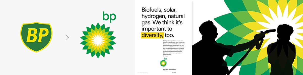
BP
A more unfortunate example of a refresh going pear-shaped is BP, who in 2000 replaced the iconic logo with a green and yellow sun-themed design (called the Helios) and a new slogan “Beyond Petroleum” to appear more ecofriendly. They retained the BP letters as they aligned with their new vision of “Better People, Better Products, Big Picture, Beyond Petroleum.” The refresh was supported by a $200 million advertising and public relations campaign, which helped BP to be perceived by consumers as one of the greenest petroleum companies in the world. But it was short-lived. The trouble was, they ‘put lipstick on the pig’. In 2010, BP was responsible for the largest oil spill of all time. At that point, the new logo suddenly became woefully ironic, and the company was accused of greenwashing.
In Summary
No matter which option you feel is right for your business, always work with an industry professional who is highly experienced in brand strategy, and can guide you through the process. And remember, you don’t always have to ‘flip the script’. Often, a more subtle approach is the way to go.
Clients always ask us what it will take to be the Nike swoosh and fail to recognise that logos like this aren’t just born. They are made, over decades.
Sidedoor is a Brand and Communications agency based in Melbourne. For more information on how we can help you develop your brand and build more equity, contact our team today.