
Collective: The psychology of colour
Colour plays a crucial part in branding. Whether it’s a logo refresh, new brand identity or developing marketing collateral; colour can evoke emotions and influence consumer behaviour.
Different colours have different meanings, connotations, and psychological effects that vary across different cultures. Along with cultural differences, colour psychology is also primarily impacted by personal preferences and personality types.
Colour psychology is an area of research examining how colour influences our behaviour and decision-making. When used in branding and marketing execution, different colours can impact the way buyers perceive a brand in ways that aren’t always apparent – e.g., how certain hues can increase appetite (warm reds) or represent calmness or innovation. (Think green and silver, respectively.)
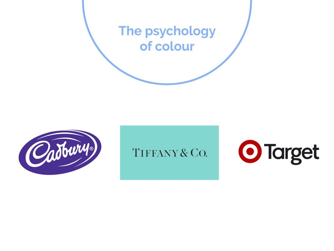
Brand utopia is when a brand owns a colour in consumers’ minds. Thus, some leading brands focus on their colour palette and have trademarked their colour within their category to ensure ownership and recall, e.g., Cadbury, Tiffany, Target etc. They fight vigorously to maintain this colour association and ownership, and have often take legal action against anyone trying to copy or leverage this position in the market.
Choosing a brand colour
Choosing a brand colour palette is a crucial element of the brand development process. This starts with the brand strategy, which identifies the following:
- brand essence
- brand archetype/ personality
- target audience (s)
- target psychographics which explores consumer values and behaviours
Beyond the brand itself, external factors are also considered e.g.
- competitors
- current trends
- brand application
- colour psychology
The ultimate goal in brand development is to create a unique brand that’s an accurate representation of the organisation or product, and evokes the desired emotional connection and action.
However, there are also other variables to consider. Some categories are over-saturated with obvious colour choices, for example, green for eco or sustainable brands. In this case, the brand strategy may be to use a completely opposite colour to disrupt the market and cut through the noise.
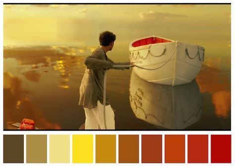
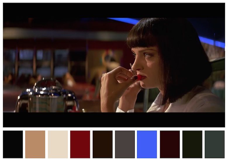
Movie Sets
Colours are also a significant consideration in the development of movie sets. As seen below, the mood and tone of the movie can be seen in this colour palette representation of these 2 very different films.
In summary, colour makes the world go round! In any creative space, whether its branding, movie sets, architecture, colour plays a crucial role in attaining the connection to the selected audience and achieving the desired perception of the final product.
There are many factors to consider that can play a role in success or failure. So think twice before spinning the colour wheel and give it due consideration.
FUN FACTS
The ugliest colour in the world: drab dark brown
Pantone 448 C is a colour in the Pantone colour system. Described as a “drab dark brown” and informally dubbed the “ugliest colour in the world”, it was selected in 2012 as the colour for plain tobacco and cigarette packaging in Australia, after market researchers determined that it was the least attractive colour.
Source; https://digitalsynopsis.com/design/cinema-palettes-famous-movie-colors/